Home Page
Note
Rother OSS TODO: This feature will be included in one of the next OTOBO releases. If you need it beforehand, please contact sales@otobo.de, we will find a solution.
Use this screen to define home page configuration for different user languages, that are displayed in the external interface. The home page management screen is available in the Home Page module of the External Interface group.
This screen contains several widget for each languages, where localized content can be added.
Warning
Make sure to save your changes when you finish. The new configuration will be immediately deployed.
The following settings are available when adding or editing this resource. The fields marked with an asterisk are mandatory.
Hero Unit
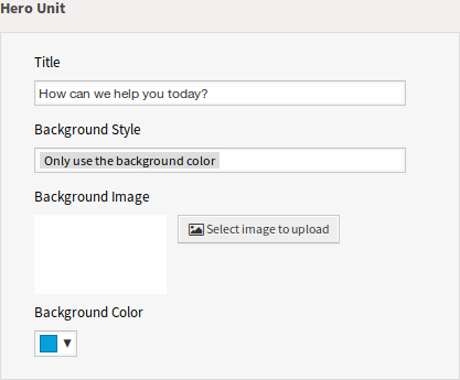
Hero Unit Widget
- Title
This is the most important sentence or motto of the home page.
- Background Style
Define the behavior of background image and background color. The following options are available:
Only use the background image
Only use the background color
Use the background image and overlay it with the selected color
- Background Image
Select an image used as background image for the hero unit. To select an image, click on the Select image to upload button and chose an image from your file system.
- Background Color
To change the background color, just select a new color from the color palette. You can chose from the pre-selected colors or define other colors by choosing it from the color selector or typing the hexadecimal value.
Ticket List
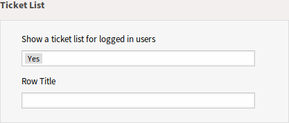
Ticket List Widget
- Show a ticket list for logged in users
This setting defines if the ticket list should be visible for logged in users or not.
- Row Title
This is an optional title for the row, that contains this widget in the external interface.
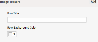
Link Lists
The link lists are displayed in a separate row in the external interface.
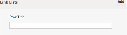
Link Lists Widget
- Row Title
This is an optional title for the row, that contains this widget in the external interface.
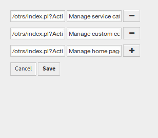
You can add up to four link lists by clicking on the Add button in the top right corner of the widget.
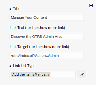
Link List
- Title *
The heading text that are displayed in this item.
- Link Text
Add the text for the show more link.
- Link Target
Add the URL for the show more link.
- Link List Type *
Specifies the functionality how the item will be added.
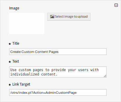
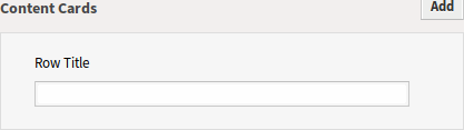
Content Cards
The link lists are displayed in a separate row in the external interface.
Content Cards Widget
- Row Title
This is an optional title for the row, that contains this widget in the external interface.
You can add up to three content cards by clicking on the Add button in the top right corner of the widget.
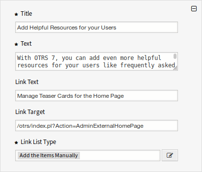
Content Card
- Title *
The heading text that are displayed in this item.
- Text *
The text for this item.
- Link Text
Add the text for the show more link.
- Link Target
An URL that will be opened after clicking on this item in the external interface.